WEEK 2
CRAZY 8s
CRAZY 8s
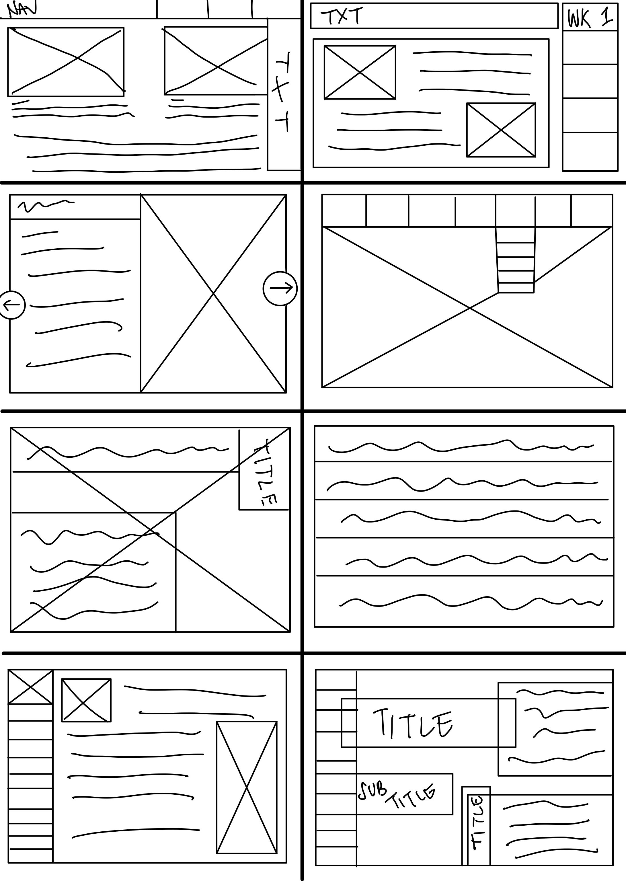
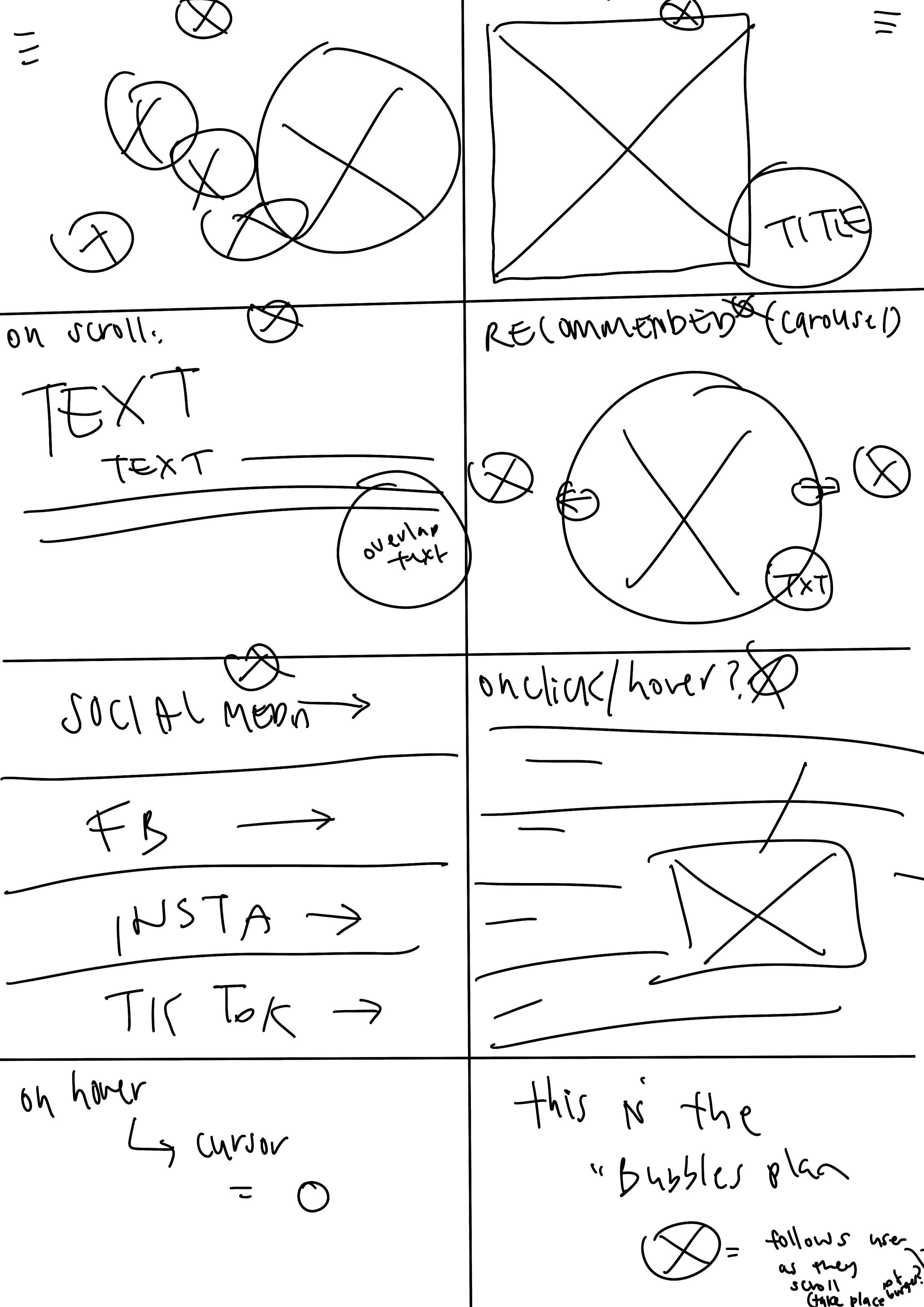
In class we participated in a crazy 8s activity, in which we were given 8 minutes to come up with 8 quick wireframe designs, whilst the first few designs were easy to imagine, the later designs quickly got difficult, leading us to get more creative with the designs as time went on.
In my first attempt I focused mainly on creative ways to combine text and image, including utilising image carousels as well as overlapping text and image.
I also explored creative ways to implement a navigation bar, whether it be semi-hidden, part of a drop down hamburger menu, scrollable carousel, or overlapped with text. I aimed to implement a navigation bar for ease of use and accessibility.
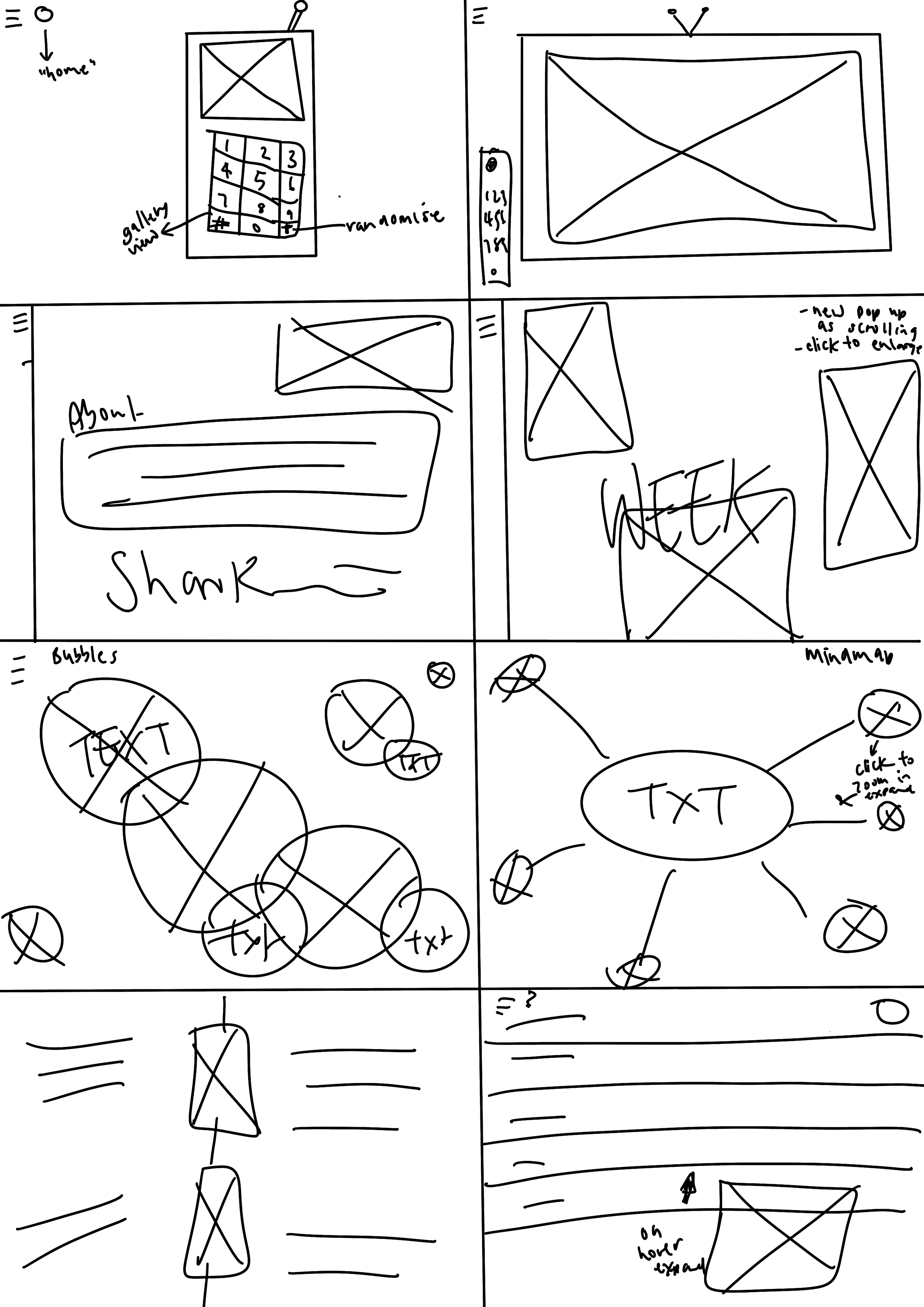
CRAZY 8s EXTENSION
After class, and after doing more research, I decided to retry my crazy 8s and aimed to come up with more creative and inspiring wireframes.
My second round of crazy 8s included using more visual imagery, including a Y2k aesthetic phone, a television with remote, a scrollable mindmap, bubbles and hidden images that pop out when hovered over.
I also explored making the page continually scrollable from all directions. Whilst not the most accessible on mobile, it inspires endless creativity and exploration on desktop.
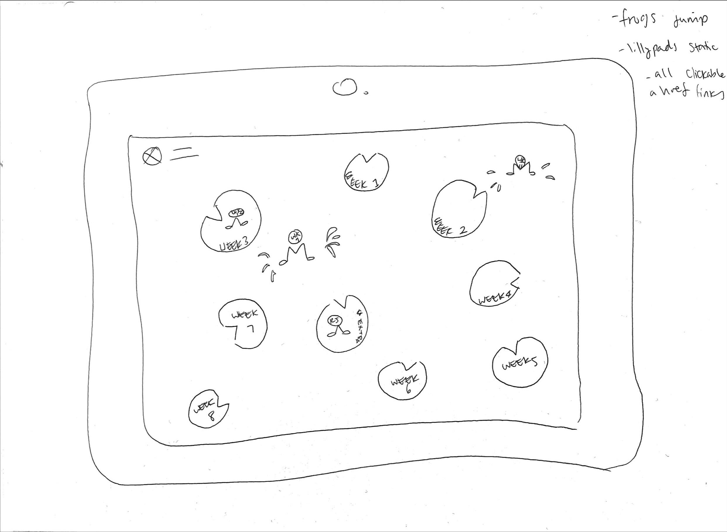
MAKE IT BLING
In class we experimented with wireframing our webpage, including scrollability and step by step use. In this instance I aimed to utilise a homepage with clickable buttons that would then lead to individual week pages.
Each page would contain a header, as well as a main image and a description. I also explored utilising a carousel, and a footer with pop up images linking to social media and about pages.
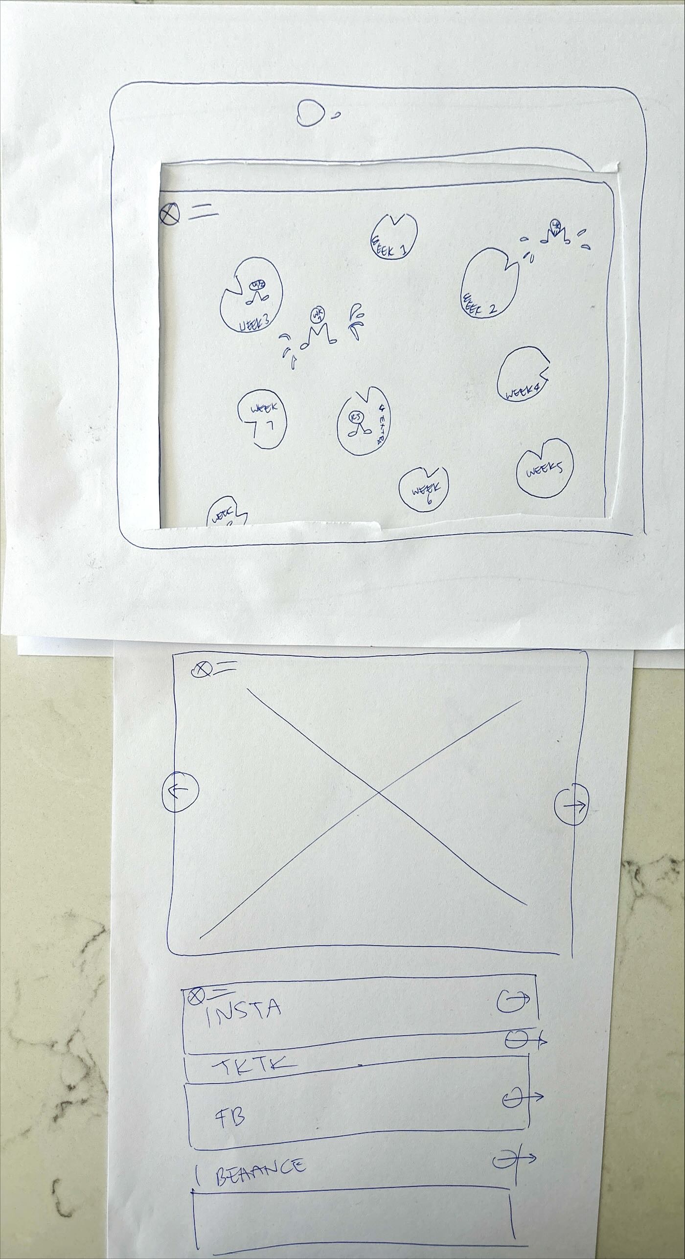
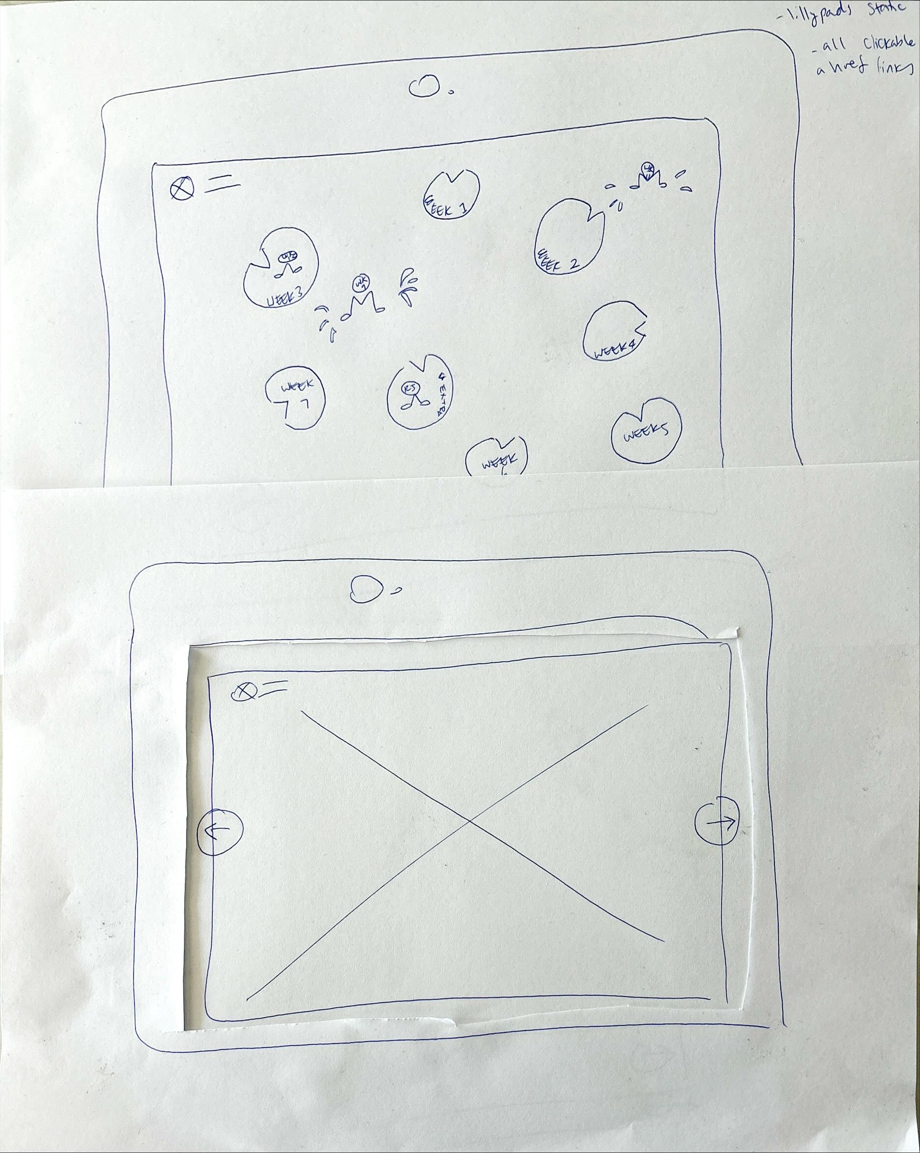
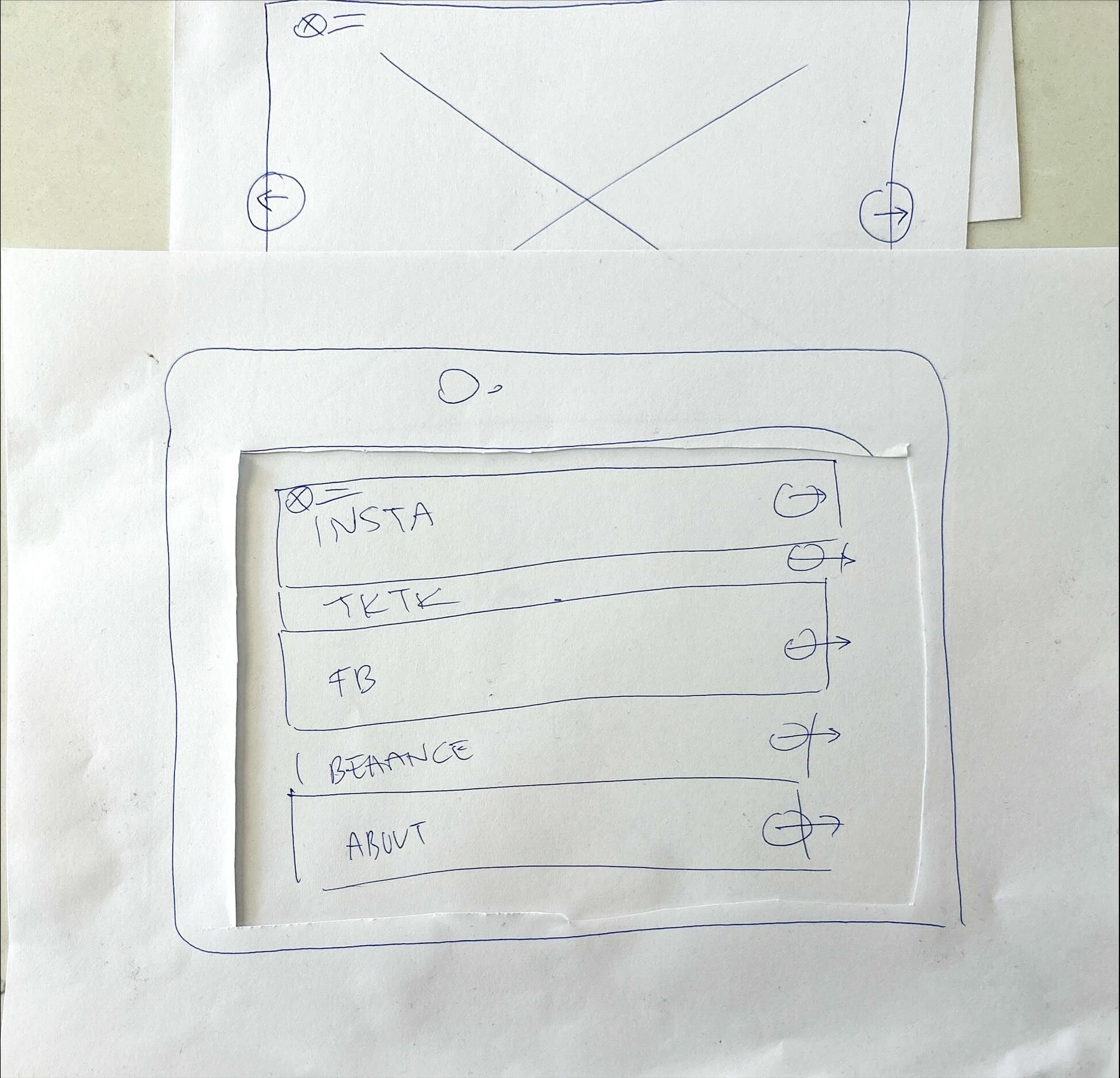
PAPER PROTOTYPING
At home I utilised paper prototyping to get a better grasp on how a user would interact with my website, not just through static page images.
I was mainly focused on my aim for the homepage scrollability, including a carousel, interactive buttons leading to about pages and social media, as well as a better understanding for the look of my lillypad landing page.
For assignment 2, I'd specifically like to learn how to code a carousel for better image layout such as those below. I'd also like to experiment with animation and hiding items on pages so the user can only see one section at a time. For the time being I have aimed to do this through the use of padding.