WEEK 3
FLUID DESIGN
FLUID DESIGN
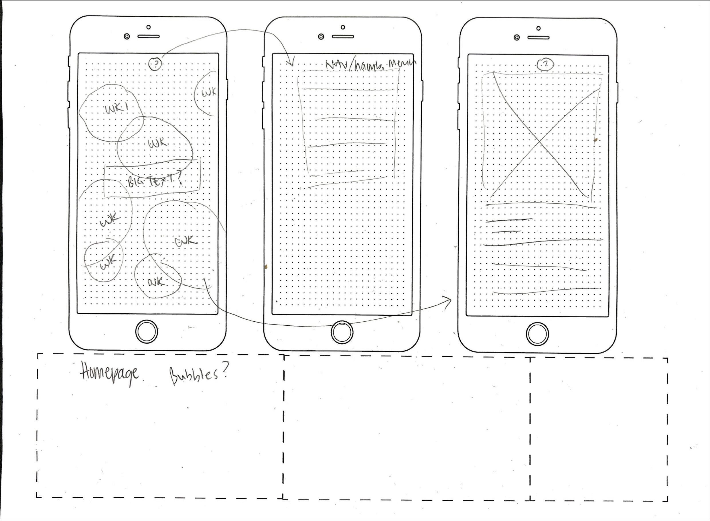
In my first fluid design I utilised my original bubble idea, with overlapping bubbles of different opacity and colours animated across the screen. This design involved a lot of overlapping shape, image and text, which was not particularly mobile friendly. I explored using a hamburger menu, as well as scrollable week pages to make the design more mobile friendly..
In class we learn about using @media to create different sizes for different screens. Whilst I've mostly implemented this, there are occasions where not all items are responsive, or at least not correctly responsive. I'd like to fix this in assignment 2 to make the website more accessible for mobile and tablet users.
FLUID DESIGN
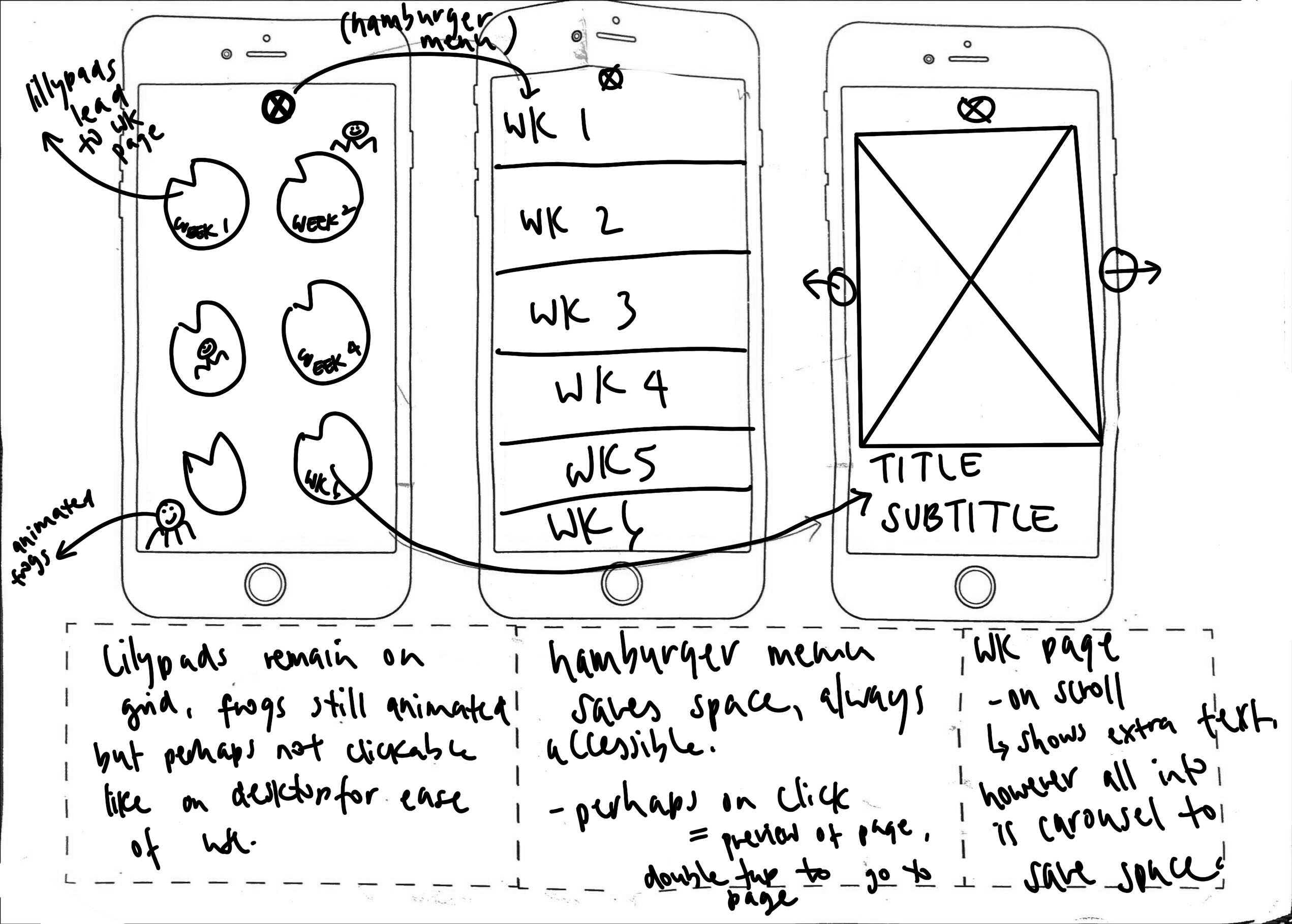
At home I decided to revisit my fluid design for mobile with my new frog/lillypad design.
Whilst not much changed overall, I decided to make the design more mobile friendly by having the lillypads stay static, and the frogs animated. Whilst I kept the hamburger menu idea for accessibility, I was interested in having users have to double tap to go to the page link, as when only tapped once, a preview for the page pops up. I think this would be intersting for interactivity.
For space reasons I instead decided to implement a carousel between photos/information on the weekly pages so that users can tap through the carousel with ease rather than having to keep scrolling down, this allows access to all information much easier.